Labels

Monday, August 30, 2010

Lim Kah Guan 105030179

1.Embrace of the future


Description:
-PetronasTwin Tower, was the world’s no.1 tallest building from 1998 to 2004, until it was surpassed by Taipei 101.
-Nevertheless, the Twin towers are the tallest twin tower in the world and is recognized as being the world’s tallest high rise of the 20thcentury.
-and below the twin towers are SuriaKLCC, a very popular shopping mall.
-And with the Prominent feature of tower, the double decked sky bridge on 41 and 42 floors. Providing access between on towers.
-So, it can be said that, it have the potential to embrace the future.

2. Freezing of the Past


Description:
-You look, the building in year 1914 in Malaysia, it tell us that the civilization, culture, economy and development in Malaysia is already to grow up in early 20thcentury, the colonial period.
But, it just stop at the period.
You can see very clearly the streetlamp they install with ignoring the building exist.

3.Transition between the Past and the Present


Description:
-small, narrow and low building and the compact space between the building, you know it is the past immediately.
At the back, very big, high and its design, you will know instantly it was the present.

4.Cultural Crossroads


Description:
-you look the building in this picture, each building have their own character and their cultural.
(white building, deep orange, light orange, and red building)
Plus, at this street(petalingstreet), you can see many kind of people come from difference country of this world, mix of thousand background and cultural.

5. Collapsing Identity


Description:
-You see the yellow building, the broken window, the broken wall and gutter. It look like very old, very weak, very poor, and seems nobody want to bother it, and people already abandoned it and forget about this building exist in this street.
It look like very unhappy and pitiful, It seem like very hard to breathe, because the signboards are far and near around it, and also the street vendor’s stall or stand are blocking it.

Cindy Nabila Ramadhania 109021527

1.Embrace of the future


Description: KLCC- Twin Towers, and surroundings. Kuala Lumpur, Malaysia
Monday, August 9th, 2010

Explanation: The KLCC Twin Towers is the best representative of the Malaysian modern Architecture. Its structure reflects the future world which its design is focused on the mechanism and durability rather than design of carved art like it was in traditional time. The many stories of this building which makes it very tall rather than huge to save some ground space that reflect the essence of the modern time of the building era. The materials that been used for this building are dominated most with steel and glass which a clear represent the future modern building style.

2. Freezing of the Past


Description: Central Market and surroundings, Kuala Lumpur, Malaysia
Monday, August 9th, 2010


Explanation: Malaysian traditional building design is best found at the Central Market area, Kuala Lumpur. The surrounding buildings are still keeping the Malaysian traditional design alive. The walls are still being in carved like they were many years ago. The buildings are still focusing on the design and art rather than mechanism and durability, for showing the Malaysian culture lasts forever. The windows also the reflection of the traditional design, which the opening are being hanged side-to-side and the frames, some, are still made out of carved wood. The roof still use the triangular shape rather than flat.

3.Transition between the Past and the Present


Description: Pharmacy, and Kasturi. Central Market and surroundings Kuala Lumpur, Malaysia
Monday, August 9th,2010


Explanation: The transition of combination of the past and the present of a building can be found at the Ally Pharmacy and Kasturi Hotel, Central Market, Kuala Lumpur. The buildings still keeping the traditional design value alive, in other hand, they also manage to reflect some of the present building value. The buildings contain more than 1 story level, which represent the present reflection. But the windows, and its frames, and walls are still being carved and in woods, as in traditional building design. The building both focusing on durability and design of art.

4.Cultural Crossroads


Description: Central Market and surroundings Kuala Lumpur, Malaysia
Monday, August 9th, 2010

Explanation: The buildings that are shown at the photo beside, are the examples of the culture crossroads architecture combination. The buildings use several mixtures of between the Malaysian house design and the European design’s. These buildings are all consist of columns which are derived from the European culture, Greek and Italian orders. And the roof of the white building, the triangular shape part is also reflect the Roman Architecture style. the arches above the windows show the Gothic era architecture of style. But the rest of the elements of the house are still using the Malaysian’s house design principle.

5. Collapsing Identity


Description: Bangunan Funo Keong, Central Market and surroundings Kuala Lumpur, Malaysia
Monday, August 9th, 2010

Explanation: These buildings are somehow we could say the examples of the Collapsing of Identity. The characters of these buildings are not being focused, whether they are using the Modern building principle or the Traditional building principle. There are more than one story level on these buildings, but not be a representative of the modern architecture because looking on its materials, are still using brick, tiles and cement just like the traditional design. And it’s quite difficult to identify the aim of these building because of the confusion between whether it’s aiming for design or durability because they don’t show the characters of both.

Salem Saeed Salem Bingarban 108021491

1.Embrace of the future


The convention centre of KL, this photo was taken on 09/08/2010

The embrace of the future at the KLCC zone and it is just a part of Kuala Lumpur developed areas. The convention centre of Kuala Lumpur is very modern style and it’s also built by different kind of shapes and form by using steel material and glass, so architects created the design of this building to be more attractive for people, because it visited by different people with different minds. The building used more steel columns than concrete around the whole building. The area of KLCC got many style around it but the best is Petronas Towers it was and it is very attractive towers.

2. Freezing of the Past


This building located at the central market area, the photo was taken 09/08/2010

Freezing the past we can find it in this building where it is at the central market area of Pasar Sini. The building is still keeping it’s style and texture, the beauty of Malaysian design. This house built in 1914 so it is almost 96 years old. Pasar Sini were the heart of Kuala Lumpur before the new city built, the beautiful thing that everything in this area Still as it was they didn’t change the design of those building even the new building are nearly designs like traditional designs of Malaysia .

3.Transition between the Past and the Present


Al-syakirin Mosque of KLCC area. This photo was taken on 09/08/2010

Al-syakirin mosque , it’s located at one of the most modern zones of Kuala Lumpur it’s KLCC area. The mosque actually is very new, but the shape and the style of it is very old as Islamic form of mosque, so the designers of the mosque tried and done the modern materials and structure with old style and shapes. The dome is made of steel, marble and glass as we see but the style and form of the dome used to built by stones in past time, but for nowdays the materials are very easy to use and play with the shapes with the same texture and design of the past. So the dome is just one example of many.

4.Cultural Crossroads


This building located in Petaling Street near by central market area of Pasar Sini. The photo was taken 09/08/2010.

Actually we can call this building a culture crossroads because if u look at the building we will get the different forms and designs. This building used a Malaysia window style it has many openings for ventilation and air movement. Columns built as European form we can see that on the texture of the columns and the shape, so the third culture is Chinese style where it is placed at the top of the building as a decoration of it.

5. Collapsing Identity


This photo taken at the China Town shops area. The photo taken on 09/08/2010

This part of China Town is one of the new space in Kuala Lumpur. This area designed and planned as a new space for people to get around easily during their shopping time or selling as well. This area is very open area for the ventilation and the air movement, because there are a lot of visitors to this area so people need to have air for cooling the area. The roof form built by steel and glass. The shops as well designed as a new structure planned so we can call this area a Collapsing of Identity because the whole area around got very old styles and building but the street is almost new so that’s the main different.

Alireza Nateghi

1.Embrace of the future


Description: This building is KLCC, In front of the Jalan Ampang and Jalan P Ramlee crossroad, this picture is taken on 09/08/2010

Explanation: Our future society need more place for residence, more comfort ,more secure, and all these requirements will make the buildings same as PETRONAS Twin Tower. It is one of the tallest buildings in the world, a skyscraper, a city in the sky with the all humanity needs. The base is Islamic symbol but the building’s body is modern. The material which is glass and aluminum for exterior surface, concrete and steel for the body, using of space in above the ground more than on the ground, a suitable landscape around it, perfect security . All these express a good design for future.
2. Freezing of the Past


Description: This building is between the Chinatown and Pasar seni, this picture is taken on 09/08/2010

Explanation: In this building we can see almost all the traditional elements and also influence of west architecture. There are not any elements and details of modernism. When you look at the modern building in the behind of this building, you can understand all the differences between them.

3.Transition between the Past and the Present


Description: This building is belong to FTMS College, the place is in Chinatown, this picture is taken on 09/08/2010

Explanation: This building express cultural crossroads very well. Column’s capitals are for Ionic period in Greek. Rounding arch above the windows, cornice, pediments, stone key in the middle of arch… all these show the influence of Greek architecture in Malaysia in long time ago.

4.Cultural Crossroads


Description: The name of this building is EAGLE EYE, The place is near to Pasar seni, this picture is taken on 09/08/2010

Explanation: As you can see there are two buildings which one of them is traditional and other is modern but without any of traditional symbol. It is taller than traditional style and It is about shape of windows as well. There is not arcade for entrance. The shape of the base and windows is rectangle without suitable space. Thus with the proper compare as you can see in this building (EAGLE EYE) Malaysian identity is lost.

5. Collapsing Identity


Description: KLCC , In front of the Jalan Ampang and Jalan P Ramlee crossroad, this picture is taken on 09/08/2010.

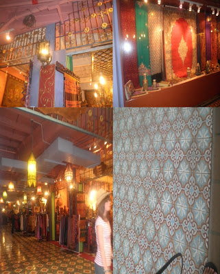
Explanation: This shape of tiling on the walls came from traditional design, such as rectangle, diamond and cubic design. Louver behind the windows also is other element of traditional which used in the present architecture.

Reety Lachhman

1.Embrace of the future


Description: PETRONAS twin towers at KLCC. 09/07/2010

Explanation: The future is the time period in which all things become possible, and this picture is proving it all.
With increase in populations and advancement most of the buildings in Asia nowadays are growing in height. In KLCC surrounding’s the view of skyscrapers all around is just a taste of what our future will be; surrounded by beautiful, majestic and imposing buildings of 80 meters. Their designs, materials and most importantly their interior comfort, with wonderful views that varies from one corner to another, this is what these buildings brings to us. An incomparable sense of esthetic, by materials such as steel, glass, reinforced concrete and granite.

2. Freezing of the Past


Description: traditional Chinese temple in Market place on the 09/07/2010

Explanation: The past is contrasted with the present. It is also regarded as the conglomerate of events that happened in a certain point in time. But sometimes in some places of the world that “past” is still living. Though out the world and space time there is only one thing that will never change; our temples. These architectures have been repeated over and over and although its construction materials may have changed from Wooden timber, curtain walls or door panels and tiles to metal, bricks and concrete; rarely its designs. On the top of the front door you can see vestige of Chinese drawings that most of the time tells a specific story of their culture.

3.Transition between the Past and the Present


Description: KL market place on the 09/07/2010

Explanation: From past to present our architectures and architectural technique have changed. Our cities, buildings and homes have evolved to better fit our new way of living. There is a still living era of our past modified by the new modern habits of our country. In this picture we can observe that this heritage though being old has its own charm and aesthetic touch, I would even say a colonial touch. It shows the transition from pass architecture being forced to marry modern life. You may observe the traditional designs at the top of the windows, and the windows themselves that is constructed to allow ventilation into the room even in times of rain.

4.Cultural Crossroads


Description: KL market place on the 09/07/2010

Explanation: A cultural crossroad is where many cultures meet and merge. Malaysia though being an Asian country it has not escaped from western influence. In this picture u can see the use of western designs for aesthetic but also one characteristic of Chinese Malay houses, are the tiles. The structural principles of Chinese architecture have remained largely unchanged, the main changes being only the decorative details. This started in the middle of the nineteenth century, the need for shopping centers, offices, conventional halls and many others led to a blend of Western and traditional Chinese architectural styles.

5. Collapsing Identity


Description: little India in KL market place on the 09/07/2010

Explanation: Somewhere along the way Malaysian architecture has lost its Asian touch in favor of a more modern one but certainly less charming. This type of contemporary design has today become a rare beauty although it is greatly appreciated by foreigners. The tiles and lamps is an identity, a unique conception and expression. Unique, original, high quality tiles made by generations of expertise that is intriguing. Exact designs and vivid colours that was traditionally homemade. These lamps you see in the picture originate from Arabic lamps made of brass, with complicated ornaments. Its new designs had its new ability to be fixed on a wall is due to modernity.

Neda Hashemi

1.Embrace of the future


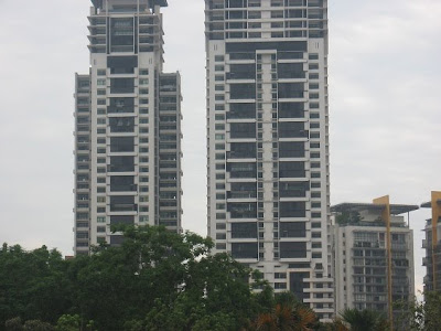
This architecture will happen in all of the word in near future. People will welcome to this buildings. These buildings are famous to skyscraper. They are like geometric forms such as cube, cylinder and etc. They have high technology.
We can see the same materials such as iron, steel, stone and so on in these buildings. Also the same colors that are white, gray, black and etc. A lot of glass use in windows. The roof is flat in all of the buildings. We observe a lot of floors.

2. Freezing of the Past


I select this picture for up theme because this building is representative past. The past that is toward fall. There are not any sign of repairing, also we can see national architecture. There are columns, wooden door, big balcony with metal balustrade and chalky walls.
Nowadays, we see less symbols of this architecture in Malaysia, except old areas such as KL Central. It is obvious that past of these buildings will remain in freezing.

3.Transition between the Past and the Present


This photo is incorporation of the past and present. We can see a lot of difference between buildings. In the old buildings we colors are yellow, red, blue, and etc but in the new buildings use cold colors such as white, gray, blak. Now a days most of roofs are flat but in the past, using gable roofs were current. Also the narrow and louvre windows with small glass are symbol of the past buildings. There are not modern materials such as steel, stone in old buildings but in new buildings we can see that. Exponent of building stuccoed and bepainted that the dark yellwo color in this building but in new buildings exponent is often of stone, steel and so on.

4.Cultural Crossroads


This photo is about Malaysian culture in architecture. I think due to Malaysia is a Islamic country , being minarets and domical buildings are representative ancient civilization and culture.
Obviously affront wall is reticular that is one symbol of Islamic architecture. We can see reticular balcony nearly in the middle of minaret.
Also more usage this kind of architecture is seen in mosques and holy places.

5. Collapsing Identity


This buildings are symbols of collapsing of identity in Malaysian architecture. In comparison with past, there are not traditional houses and trace of past. The new materials such as stone, granite, steel, glass, mental and so on is obvious. We often see a lot of window with glass, and small balcony, flat roofs, black, white and gray color, long buildings with specific design are specification of modern architecture. Also we can see many floors in this buildings.

Abdulla Aneel 109071206

1.Embrace of the future


Description: The PETRONAS towers, KLCC, taken on 16th August 2010

Explanation: The twin towers are made of stainless steel and are very massive. It is 1482 feet high. It contains glass windows of 32000. It is made up of symmetric and geometric lines. There is a sky bridge connecting the two towers. The PETRONAS Towers succeed at acknowledging Malaysia’s past and future, embracing the country’s heritage while proclaiming its modernization.

2. Freezing of the Past


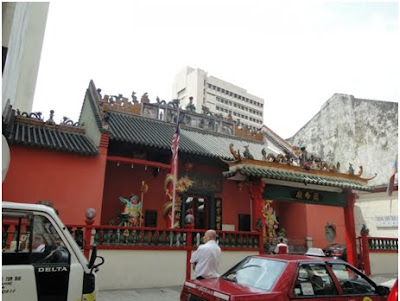
Description: The Chinese Temple, Near Central Market, taken on 16th August 2010

Explanation: Temples symbolize the long history and rich culture of China, and are regarded as valuable art treasures. The temple contains pyramidal roof tops and is also decorated. They use the dragon for decorations mainly. Chinese temples are well kept cultural artifacts of every dynasty. And temple culture has influenced every aspect of Chinese people's life such as painting, calligraphy, music, sculpture, architecture, temple fairs, folk-customs and many others.

3.Transition between the Past and the Present


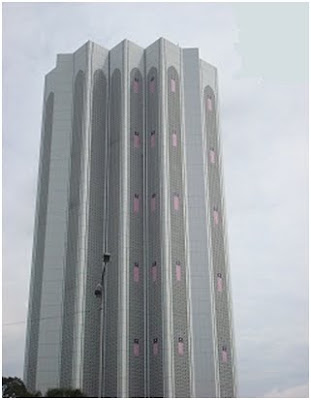
Description: The Dayabumi Complex Building, KL, taken on 16th August 2010

Explanation: The Dayabumi Complex is one of the first buildings to boast a Malaysian style architecture. The 35-storey Dayabumi is 157 meters high. At the time of its completion, it was regarded as the most expensive building ever built in Malaysia. The gleaming white structure incorporates Arabic elements into the modern high-rise architecture, helping it to blend with the surrounding Moorish and Byzantine architecture. Dayabumi Complex houses government offices, a shopping arcade and has an annex that houses the General Post Office.

4.Cultural Crossroads


Description: Central Market , KL, taken on 16th August 2010.

Explanation: Built in 1888 by the British who ruled Malaya at that time, the Art Deco building used to house a wet market for Kuala Lumpur citizens and tin miners. Further expansions were made in 1889, 1895, 1920 and 1921. By 1933, the expansions to the warehouse would result in its current size today. Declared as a Heritage Site, it is now considered by many to be the best place in town to experience Malaysian culture, art and craft.

5. Collapsing Identity


Description: The Chinese Shops, KL, taken on 16th August 2010.

Explanation: These shops are built by the Chinese when they traded between China and Malaysia. These shops contains narrow front so they will have to pay less tax to the government. Although front is narrow the back side is extended. As it go towards back side privacy increases. So it is no shop at the back. It is a private home behind the shop.

Atena Rajaei

1.Embrace of the future


I choose this photo because these buildings are in place called KLCC. The KLCC is a new place with a long buildings that they are symbols of embraced of future. Maybe in near future we will see that in all of the Malaysia. The shape these buildings are cube, cylinder and etc.The colour of new building usually are white, black, grey and brown with a lot of windows and levels. The roofs of these buildings are flat. There are in that special design for making buildings. This building has high technology.

2. Freezing of the Past


I choose this photo because this building is in place called Central Market. In that place there are many old buildings. This building has big windows with different colour of house .around that have special and prominent design. The door of windows making from wood and have wood balustrade. The roof of this building is gable roof with a small circle window under the roof. The view that has special and old design. This building has column that are on the wall and have old design.
This building has several colours such as blue, brown and white. The wall of this building is chalky wall. I choose this photo because I think it has many difficult designs with other building.

3.Transition between the Past and the Present


In this picture we can see the part of past in the present time. They are long window with material of mental. The view of this building is chalky walls and a lot of column that it gives special beauty to building. The colour of this building is pink and white. We can see a lot of different between present and past in these buildings.

4.Cultural Crossroads


In my opinion we can see multi cultural in this building .It has new structure and old structure together. In sight of this building has small square with traditional design that show cultural crossroad but it is tall tower with several floor .The colour of this building including white , gray ,and black . In contrast in old building use of different colour for instance orange, red, yellow and etc. For sight of this building more use of stone, glass, steal and mental. This building has high technology and use in that from today method. The shape of that is like cylinder.

5. Collapsing Identity


I choose this building because don’t have any things from past. In the past, building s were one or two floors but now, in the new buildings there are many floors with a lot of windows. In this building we can see different material such as stone, steal, glass, mental and so on, but in old building used of wood, chalk and etc.
People choose these buildings for life because of are comfortable and modern for living, people like to use that.

Syamila Kamal

1.Embrace of the future


THE MODERNITY CAN BE SEEN THROUGH THIS BUILDING. THE ARCHITHECTURE AND URBAN DESIGN OF THE BUILDING AS SIGNS OF TRANSFORMATION. WITH ITS SKYBRIDGE CONNECTING THE TWIN TOWERS AT THE 41st AND 42nd FLOORS,PETRONAS TOWERS WOULD BE IN THE IMAGERY OF THE OFFICIAL BROCHURES .

2. Freezing of the Past


THE BUILDING WAS A VICTORIAN ARCHITECTURE.IT IS LOOKS ALIKE GRECIAN-SPANISH STRUCTURE.PRIOR TO SECOND WORLD WAR MANY SHOP HOUSE A BUILT IN THE OLD CITY CENTRE.THIS SHOP HOUSE DREW INSPIRATION FROM STRAITS CHIENES AND EUROPEAN TRADITIONS.THE WINDOWS EXACTLY LOOKS ALIKE MALAYSIAN CULTURE.

3.Transition between the Past and the Present


FROM THE PICTURE WE CAN SEE THAT THE OLD MALAYSIAN DESIGN OF THE BUILDING. THE EXISTING WINDOWS ARE COMBINATION OF BOTH OLD AND NEW ARCHITECTURE DESIGN.THE BUILDING ITS MADE FROM CONCRETE.THE ROOF DESIGN SYOMBLISE OLD MALAYSIAN ARCHITECTURE.

4.Cultural Crossroads


THE CENTRAL MARKET IT’S AN OLD BUILDING BUILT IN 1880.THE BUILDING ITS SELF REPRESENTS OLD MALAYSIAN ARCHITECTURE AND INSIDE THE MARKET,YOU WILL FIND OLD ARTIFACTS REPRESENTING OLD CULTURER DESIGNS.

5. Collapsing Identity


THE OLD BUILDING HAS LOST SOME OF ITS IDENTITY THIS IS BY,BUILDING A MODERN BUILDING BESIDE THE OLD BUILDING THUS,LOOSING HALF OF ITS IDENTITY.THIS CAN BE SEEN BY THE USE OF DIFFERENT MATERIAL AND ARCHITECTURE DESIGN.THE MODERN BUILDING ITS BIGGER THAN THE OLD BUILDING.

Ibrahim Labeed Abdul Wahhab 109070765

1.Embrace of the future


DESCRIPTION: Petronas twin towers, Kuala Lampur 9th August 2010

EXPLANATION: Petronas twin towers of Kula Lapmpur describes the theme “embrace of the future” due to the usage of new methods in building of the mega structure. The building is built in one of the deepest foundation using a lot of concrete and steel. The towers resemble the Islamic architecture in Malaysia.

2. Freezing of the Past


DESCRIPTION: Chinese Temple 9th August 2010

EXPLANATION: The Chinese temples best describes the theme “freezing of the past”. It is because of the usage of the colourful detailing and usage of the colour red which symbolises the culture of the Chinese people. The most important feature of this temple is the roof. It is decorated by using different designs like dragons which is very important feature in Chinese culture.

3.Transition between the Past and the Present


DESCRIPTION: Suria KLCC 9th August 2010

EXPLANATION: The shopping complex is a great representation of “transition between past and present”. It is because it contains features that were used in the early Malaysian architecture. For example, lot of openings, roofs which gives shades outside, and dark interior.

4.Cultural Crossroads


DESCRIPTION: Shop Houses (kongsi)near central market 9th August 2010

EXPLANATION: Some of the shop houses near the central market can be considered as “cultural cross roads”. These shop houses are influenced by the Chinese living in Malaysia. Since the Chinese first came to Malaysia due to the trade routes, the ground floor of the houses (front) were used as shops. These houses are very narrow in width and long in length. It also has a mixture of western influence in the design of the buildings.

5. Collapsing Identity


DESCRIPTION: KFC near central market 9th August 2010

EXPLANATION: I chose KFC for the theme “collapsing of identity” because the main structure is a perfect example of the Chinese Malaysian architecture and in the present days it has being modified in such a way that the purpose of each part of the building has being lost. Earlier days the inner parts of the structure is a private area for the people living there.